Today's post is an excerpt from the book 50 Lighting Setups for Portrait Photographers, Volume 2: Easy-to-Follow Lighting Designs and Diagrams, by Steven H. Begleiter. It is available from Amazon.com and other fine retailers.
CAMERA DATA
Camera: Canon 40D
Aperture: f/4
Lens: EF 24–105mm at 47mm
Shutter speed: 1/30 second
ISO: 200
Camera: Canon 40D
Aperture: f/4
Lens: EF 24–105mm at 47mm
Shutter speed: 1/30 second
ISO: 200
ASSIGNMENT
My nephew was getting married and was meeting us for a brief visit with his fianceé. I hadn’t planned to take a portrait of them but thought it would be a nice change to create an engagement photo. They were leaving early in the morning to head back to Los Angeles, so I didn’t have much time to plan the shot—nor did they have time to dress for the session.
My nephew was getting married and was meeting us for a brief visit with his fianceé. I hadn’t planned to take a portrait of them but thought it would be a nice change to create an engagement photo. They were leaving early in the morning to head back to Los Angeles, so I didn’t have much time to plan the shot—nor did they have time to dress for the session.


LIGHTING AND POSING
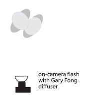
I picked an open shade area to avoid any high contrast. There wasn’t much light (f/4 at 1/15 second), so I increased my ISO to 200 to bring it up to 1/30 second at f/4, helping me to avoid motion blur. I set my Canon 530EX flash on the hot shoe, with a Gary Fong diffuser. I then switched my camera to shutter priority (Tv) mode with the camera at 1/30 second.
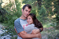
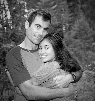
I had Trevor and Mari turn to each other and asked Trevor to wrap his arms around Mari. I took about three pictures before they had to leave. The rest was a transformation in Photoshop.
POSTPRODUCTION
When I imported the images into Lightroom, this one stood out. I decided to play with it in Photoshop and see if I could dress it up and present it to them as a canvas print.
I exported it to Photoshop and duplicated the background layer. My first step was to crop the image to a square (like the old Hasselblad format), getting rid of the excess background to keep the attention on the couple. Once that was done, I checked the levels and constricted the histogram slightly by sliding the arrows toward the middle.
At this point, I converted the image to black & white using a black & white adjustment layer. Creating this layer brings up a dialog box with color sliders. If you recall the old days of using color filters to alter the black & white tones in your film images, this will look familiar. By sliding the yellows and greens to the left I was able to evenly darken the background to bring out the subjects. Sliding the reds, blues, and magentas to the right lightened their skin tones.
My next task was to lighten their eyes (it was an early-morning shoot, after all!) and brighten their teeth. I used the quick selection tool to select the teeth and eyes on both subjects. I used the refine edges command (Select>Refine Edges) to tweak the selection. Once I was satisfied with it, I used the hue/saturation dialog box to desaturate the tones in their eyes and teeth (–43) and increase the lightness of these areas (+32). You can’t go too far without the change looking artificial.
I then selected the spot healing brush to get rid of a few stray hairs. To remove the dark circles under their eyes, I selected the dodge tool and set it to shadows at 50 percent. I also wanted to soften their faces slightly, which I did using the surface blur filter (radius: 12; threshold: 7).
The last item on my list was removing the Pepsi logo from the t-shirt. I used the polygonal lasso tool to select the Pepsi logo, then eliminated it using the clone stamp tool. It looked good to me, so I flattened the image and sent the file to Canvas on Demand, who shipped the final artwork directly to Trevor and Mari in Los Angeles. (When I visited them, I saw that they did a beautiful job framing the canvas print and hung it in their guest room—a high compliment!)Editorial note: Please purchase the book to see the full sequence of images and screen shots from this session and postproduction process.


