 Today's post is an excerpt from the book 100 Techniques for Professional Wedding Photographers, by Bill Hurter. It is available from Amazon.com and other fine retailers.
Friday, November 30, 2012
Effective Strategies for Posing Wedding Groups
 Today's post is an excerpt from the book 100 Techniques for Professional Wedding Photographers, by Bill Hurter. It is available from Amazon.com and other fine retailers.
Tuesday, September 25, 2012
Corrective Posing for Weddings
Today's post is an excerpt from the book Master Posing Guide for Wedding Photographers, by Bill Hurter. It is available from Amazon.com and other fine retailers.
It's important to understand that people don't see themselves the way they actually appear. Subconsciously, they shorten their noses, imagine they have more hair than they really do, and in short, pretend they are better looking than they really are. A good portrait artist knows this and knows how to reflect the same level of idealization in portraits of the subject. As a matter of procedure, the photographer analyzes the face and body and makes mental notes as to how to best light, pose, and compose the subject to produce a flattering likeness. Because they are always shooting under pressure, wedding photographers must master these techniques to such a degree that they become second nature.
Camera Height and Perspective
Camera Height. When photographing people with average features, there are a few general rules that govern camera height. These rules will produce normal perspective with average people.
When the perfect camera height for a head-and-shoulders portrait is used, the face is well proportioned and oval—as shown here.
• For head-and-shoulders portraits, the rule of thumb is that camera height should be the same height as the tip of the subject’s nose or slightly higher.
• For three-quarter-length portraits (portraits that include the subject’s figure down to mid-calf or mid-thigh), the camera should be at a height midway between the subject’s waist and neck.
• In full-length portraits, the camera should be the same height as the subject’s waist.
Controlling the Perspective
As the camera is raised or lowered, the perspective (the size relationship between parts of the photo) changes. By controlling perspective, you can alter the physical traits of your subject.
Correcting Specific Problems
Overweight Subjects
Dark clothing will make a person appear ten to fifteen pounds slimmer. While this is is something you could recommend for the engagement session, it’s beyond your control at the wedding. Therefore, careful posing will be an important tool for addressing the issue. Begin by using a pose that has the subject turned at a 45-degree angle to the camera. Never photograph a larger person head-on; it will only accentuate their size. Standing poses are more flattering for overweight subjects. Seated, excess weight accumulates around the waistline. Selecting a pose that turns your subject away from the main light is also desirable, as this will put more of the body in shadow and produce a slimming effect.
Thin or Underweight Subjects
When posing a thin person, have him or her face the camera more directly to provide more width. Selecting a pose that turns your subject toward the main light is also desirable, as this will put more of the body in the light and produce a widening effect.
Elderly Subjects
The older the subject, the more wrinkles he or she will have. It is best to use some type of diffusion, but do not soften the image to the point that none of the subject’s wrinkles are visible. Men, especially, should not be overly softened, as their wrinkles are often considered “character lines.” In the absence of light modifiers, you can also pose the subject so that the main light strikes primarily the front of their face, minimizing any deep shadows in the wrinkles and deep furrows of the face.
In general, older subjects should also be smaller within the composition. Even when making a head-and-shoulders portrait, reducing the subject size by about 10–15 from how you might normally frame the image will ensure that the signs of age are less noticeable.
A good rule of thumb when making a three-quarter-length portrait is to keep the camera back parallel to the subject plane. This reduces subject distortion and helps keep horizontal and vertical lines true.
Eyeglasses
With digital capture, it’s easy to see if eyeglasses are captured with reflections. If you have a chance to retake the photo, have the person slide the eyeglasses down on his or her nose slightly. This changes the angle of incidence and helps to eliminate unwanted reflections.
One Eye Smaller than the Other
Most people have one eye smaller than the other. This should be one of the first things you observe about your subject. If you want both eyes to look the same size in the image, pose the subject in a seven-eighths to three-quarters view, placing the smaller eye closer to the camera. Because objects farther from the camera look smaller and nearer objects look larger, this will cause both eyes to appear to be more or less the same size.
Baldness
If your subject is bald, lower the camera height so less of the top of his head is visible. In post-production, you can also try to blend the tone of the background with the top of your subject’s head.
Double Chins
To reduce the view of the area beneath the subject’s chin, raise the camera height so that area is less visually prominent. You can also have the subject tilt their chin upward, tightening the area, and (if possible) raise the main light so that as much a possible of the area under the chin is in shadow.
Wide Faces
To slim a wide face, pose the person in a three-quarters view and turn them away from the main light. This places the image highlights on the narrow side of the face for a slimmer look.
Thin Faces
To round a narrow face, pose the person in a seven-eighths view, keeping as much of the face as possible visible to the camera. Turn them toward the main light to place the image highlights on the broader side of the face for a fuller look.
Broad Foreheads
To diminish a wide or high forehead, lower the camera height and tilt the person’s chin upward slightly. Remember, the closer the camera is to the subject, the more noticeable these corrective measures will be. If you find that by lowering the camera and raising the chin, the forehead is only marginally smaller, move the camera in closer and observe the effect again—but watch out for other distortions.
Deep-Set and Protruding Eyes
To correct deep-set eyes, try having the subject raise their chin. To correct protruding eyes, have the person look downward so that more of the eyelid is showing.
Large Ears
To scale down large ears, the best thing to do is to hide the far ear by placing the person in a three-quarters view, making sure that the far ear is out of view of the camera (or in shadow). If the subject’s ears are very large, examine the person in a profile pose. A profile pose will totally eliminate the problem. Also, longer length lenses will appear to compress the visible ear, reducing its prominence.
Uneven Mouths
If your subject has an uneven mouth (one side higher than the other, for example) or a crooked smile, turn his or her head so that the higher side of the mouth is closest to the camera, or tilt the subject’s head so that the line of the mouth is more or less even.
Long Noses and Pug Noses
To reduce the appearance of a long nose, lower the camera and tilt the chin upward slightly. You should also select a frontal pose, either a full-face or seven-eighths view, to disguise the length of your subject’s nose.
Long Necks and Short Necks
While a long neck can be considered sophisticated, it can also appear unnatural—especially in a head-and-shoulders portrait. By raising the camera height and lowering the chin you will shorten an overly long neck. When photographing a male subject, pulling up his collar will also shorten an overly long neck. Conversely, lowering the camera height and suggesting a V-neck shirt (for the engagement session, for example) will lengthen the appearance of a short neck.
Wide Mouths and Narrow Mouths
To reduce an overly wide mouth, photograph the person in a three-quarters view with no smile. For a narrow or small mouth, photograph the person in a more frontal pose and have him or her smile broadly.
Long Chins and Stubby Chins
Choose a higher camera angle and turn the face to the side to correct a long chin. For a stubby chin, use a lower camera angle and photograph the person in a frontal pose.
Tuesday, August 21, 2012
Posing the Bride, Groom and Couple
Today's post is an excerpt from the book Master Posing Guide for Portrait Photographers, 2nd Ed. by JD Wacker. It is available from Amazon.com and other fine retailers.
Be creative, have fun, and be ready to capture images that reflect the unique character of the bride and groom.
Guide the couple into natural poses than encourage interaction.
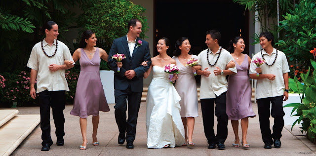
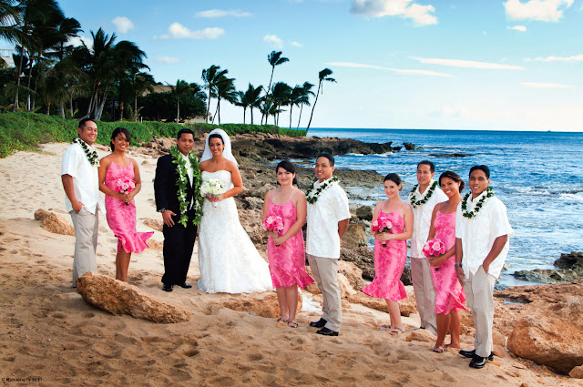
Whrranging group shots, place the most important individuals closest to the bride and groom.
Buy this book from Amazon.com.
Monday, July 16, 2012
Working with Reflectors
REFLECTORS
Photographers use reflectors to bounce light onto the subject or scene. They are available in different sizes and with various surfaces that can be used to intentionally affect the color of the light, making it warmer or cooler.
I use reflectors in many ways—to fill in the shadow side of a subject, as a main light, as a kicker light or rim light, set opposite the main light to add roundness or create tonal separation, to illuminate the background, and more.
Typically I use either a 32-inch round pop-up reflector or a 42-inch Scrim Jim with a reflective panel. However, almost any material with a reflective surface can be used as a reflector. A pop-up or folding windshield shade made of silver Mylar is a perfect emergency reflector. Covering a piece of cardboard with aluminum foil will work when you’re in a bind as well. When doing commercial or product photography, I often used small pieces of foil or Plexiglas mirrors to light a small, dark image area. At a wedding, I once used a white tablecloth to reflect light onto the shadow side of a bride’s face.
In many scenarios, a flash in a small softbox would work just as well as the bounced light from a reflector—or better—but we are learning to use the light that is available.


| This image shows how a reflector should be positioned when it is used as the main light for a standard portrait. Many people position the reflector lower, creating an uplighting effect that is not flattering for every subject. The lower position is best used for producing fill light or when you have the open sky or sun as the main light. Note the surface of this reflector. A soft silver tone is easier on the model’s eyes than a very shiny silver modifier. Also, the light that is produced is softer with this type of reflector. |
Wednesday, April 18, 2012
Engagment Session
Today's post is an excerpt from the book 50 Lighting Setups for Portrait Photographers, Volume 2: Easy-to-Follow Lighting Designs and Diagrams, by Steven H. Begleiter. It is available from Amazon.com and other fine retailers.
Camera: Canon 40D
Aperture: f/4
Lens: EF 24–105mm at 47mm
Shutter speed: 1/30 second
ISO: 200
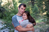
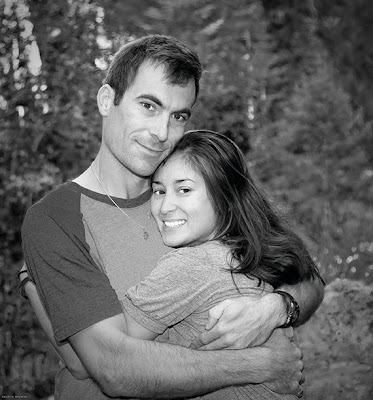
My nephew was getting married and was meeting us for a brief visit with his fianceé. I hadn’t planned to take a portrait of them but thought it would be a nice change to create an engagement photo. They were leaving early in the morning to head back to Los Angeles, so I didn’t have much time to plan the shot—nor did they have time to dress for the session.
LIGHTING AND POSING
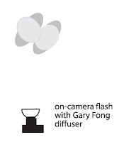
I picked an open shade area to avoid any high contrast. There wasn’t much light (f/4 at 1/15 second), so I increased my ISO to 200 to bring it up to 1/30 second at f/4, helping me to avoid motion blur. I set my Canon 530EX flash on the hot shoe, with a Gary Fong diffuser. I then switched my camera to shutter priority (Tv) mode with the camera at 1/30 second.
POSTPRODUCTION
When I imported the images into Lightroom, this one stood out. I decided to play with it in Photoshop and see if I could dress it up and present it to them as a canvas print.
Editorial note: Please purchase the book to see the full sequence of images and screen shots from this session and postproduction process.
Tuesday, February 14, 2012
LED Lighting
Today's post is an excerpt from the book LED Lighting: Professional Techniques for Digital Photographers, by Kirk Tuck. It is available from Amazon.com and other fine retailers.
TWO PRACTICAL APPROACHES
As with any new lighting instrument, photog raphers have had to learn how to leverage LEDs to maximize the benefits. I divide my use of the LEDs roughly into two approaches. The first approach uses LED to support or enhance the existing light; the second uses LED as the primary source of light.
Augmenting the Existing Light. Many assignments move quickly and call on me to improve the light I find on locations, not to totally replace it. In these situations, I depend on battery-powered units that are small and lightweight. Just as one might use a battery-powered flash to add fill light to a scene that’s predominantly lit by ambient light, I can use one small LED panel to add just the right amount of fill light or accent light to a scene.
Using this approach, a wedding photographer might want to use a tungsten-balanced, battery-powered unit in a ballroom to bring the light level on a bride up to the same level as the ballroom’s background so the contrast isn’t too extreme. A portrait shooter who does lots of outdoor portraits might need a little extra fill light in an open-shade location (to make sure that eyes look good and wrinkles are minimized) and find that a little LED panel—or two linked together—is a good match for daylight color temperature. Having an assistant hold one a few feet over to one side of the subject is a quick, convenient, uncomplicated, and aesthetically “just right” solution.
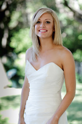
In fact, that’s just what I did with this portrait of Jana. She was standing under a covered patio with sun and trees in the background. To add soft light for fill and bring up the level of illumination, I used four small LED panels, covered with diffusion material, on a stand to the side of the model. These provided just enough illumination to make the photo work for me.
A corporate photographer might be tasked with capturing people at work. With the right small LED panel, she’ll be able to add just enough fill to counteract the unflattering top-light of the ubiquitous office fluorescent lights—without the unwanted attention caused by multiple flashes, extra cables, and battery packs. Anywhere that a little supplemental lighting may make the difference between a good photo and a great photo is a natural situation for smaller panels.
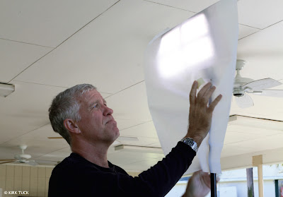
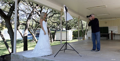
I started the setup by snapping together four of the DLC DV 60 units. I knew I’d need the power to get close to matching the sun. Note that they were covered with a very light magenta filter to match the daylight. Then I added a sheet of diffusion material over all four lights. This softened the light and made it easier on Jana’s eyes. I positioned the light as close as I could to Jana, as you can see in the overall view of the shoot setup.
LED as the Primary Light Source. The other way to use LEDs is to implement the larger panels that run off household A/C current in the same way that studio photographers now use electronic flash and softboxes. As portrait photographers, we’ve spent years sitting people down in a studio and aiming electronic flash units in large softboxes at them as main lights. We used additional small softboxes and flashes for background lights and hair lights and even fill lights. In most cases, all of these can be handily replaced by LED panels and modifiers.


