Today's post is an excerpt from the book The Portrait Photographer's Guide to Posing, 2nd Ed., by Bill Hurter. It is available from Amazon.com and other fine retailers.
SUBJECT PLACEMENT
Composition in portraiture involves proper subject placement within the frame. There are several schools of thought on proper subject placement, and no one school offers the only answer. Two formulas are given here to help you best determine where to place the main subject in the picture area.
The Rule of Thirds. Many a journeyman photographer doesn’t know where to place the subject within the frame. As a result, these less experienced artists usually opt for putting the person in the center of the picture. This is the most static type of portrait you can produce.
The easiest way to improve your compositions is to use the rule of thirds. This is a system that imposes asymmetry into the design of the portrait. According to the rule of thirds, the rectangular frame is cut into four imaginary lines that form a “tic-tac-toe” grid. The point at which any two of these lines intersect is considered an area of dynamic visual interest. The intersecting points are ideal spots at which to position your main point of interest, but you could also opt to place your point of interest anywhere along one of the dividing lines.
This applies to all print orientations. In a vertical print, the head or eyes are usually two-thirds up from the bottom edge of the image. Even in a horizontal composition, the eyes or face are usually in the top one-third of the frame.
The rule of thirds also applies equally to all portrait lengths. In head-and-shoulders portraits the eyes are the point of central interest. Therefore, it is a good idea if they rest on a dividing line or at an intersection of two lines. In a three-quarter- or full-length portrait, the face is the center of interest, so the face should be positioned to fall on an intersection or on a dividing line.
The Golden Mean. The golden mean, a concept first expressed by the ancient Greeks, is a compositional principle similar to the rule of thirds. Put simply, the golden mean identifies the point where the main center of interest should lie; it is an ideal compositional type for portraits. The golden mean is found by drawing a diagonal from one corner of the frame to the other. Then, draw a line from one (or both) of the remaining corners so that it intersects the first line perpendicularly. By doing this you can determine the proportions of the golden mean for both horizontal and vertical photographs.
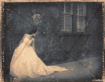 With the overlay, you can see how effectively the golden mean is incorporated into this portrait by Ken Skute.
DIRECTION
Regardless of which direction the subject is facing in the photograph, there should be slightly more room in front of the person (on the side toward which he is facing). For instance, if the person is looking to the right as you look at the scene through the viewfinder, then there should be more space to the right side of the subject than to the left of the subject in the frame. This gives the image a visual sense of direction. Even if the composition is such that you want to position the person very close to the center of the frame, there should still be slightly more space on the side toward which the subject is turned.
The same compositional principle also applies when the subject is looking directly at the camera. Rather than centering the subject in the frame, you should leave slightly more room on one side to create a sense of direction within the portrait.
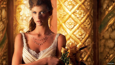 This image by Bruce Dorn is intersected by vertical lines in the background, yet they do not cut the image in half or in thirds. Instead, they act as contrasting elements to the diagonal lines spread throughout the background and also the diagonal lines within the bride’s veil and dress.
LINES
Mastering composition and posing requires an ability to recognize real and implied lines within the photograph. A real line is one that is obvious—the horizon or a door frame, for example. An implied line is one that is not as obvious, like the line created on the face by the eyes.
Position of Lines. Real lines should not run across the center of the frame. This actually splits the composition into halves. It is better to position real lines at a point one-third of the way into the photograph. This weights the photograph more interestingly.
At the Edge of the Frame. Lines, real or implied, that meet the edge of the photograph should lead the eye into the scene and not out of it. Additionally, they should lead toward the subject. A good example of this is the country road that is widest in the foreground and converges to a point where the subject is walking. These lines lead the eye straight to the subject.
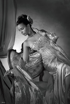 In this dramatic pose, the subject’s body forms almost countless diagonal lines—and a sweeping S curve running vertically through the frame. Notice how everything leads your eye directly to her face. Photograph by Robert Lino.
Implied Lines. Implied lines, such as those of the arms and legs of the subject, should not contradict the direction or emphasis of the composition, but should modify it. These lines should feature gentle changes in direction and lead to the main point of interest—either the eyes or the face. There should also be some sort of inherent logic in the arrangement of elements within the image that causes the eye to follow a predetermined path. This is a key element in creating visual interest and staying power.
PLEASING COMPOSITIONAL FORMS
Lines in compositions provide visual motion. The viewer’s eye follows the curves and angles of these forms as it travels logically through them, and consequently, through the photograph. The recognition and creation of compositional lines, often through posing, is a powerful tool for creating a dynamic portrait.
The S-shaped composition is perhaps the most pleasing of all the forms. In images that employ this shape, the center of interest will usually fall on or near one of the intersections established by the rule of thirds or golden mean, but the remainder of the composition will form a gently sloping S shape that leads the viewer’s eye to this area of main interest. Another pleasing type of composition is the L shape or inverted L shape. This type of composition is ideal for either reclining or seated subjects. The C and Z shapes are also seen in all types of portraiture and are both visually pleasing.
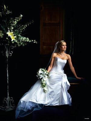 The S curve is one of the most pleasing of all compositional forms. You can see the
S shape subtly interwoven into this bride’s pose. Photograph by Stuart Bebb.
SHAPE
Shape is nothing more than a basic geometric shape found within a composition. Shapes are often made up of implied or real lines. For example, a classic way of posing three people is in a triangle or pyramid shape. You might also remember that the basic shape of the body in any well-composed portrait creates a triangular base. Shapes, while more dominant than lines, can be used similarly in unifying and balancing a composition.
The classic pyramid shape is one of the most basic in all art and is dynamic because of its use of diagonals with a strong horizontal base. The straight road receding into the distance is a good example of a found pyramid shape.
Sometimes shapes may also be linked, sharing common elements in both of the groups. For example, a single person in between can link two groups of three people posed in pyramid shapes, a common technique in posing group portraits.
There are an infinite number of possibilities involving shapes and linked shapes and even implied shapes, but the point of this discussion is to be aware that shapes and lines are prevalent in well-composed, well-posed images and that they are vital tools in creating strong visual interest within a portrait.
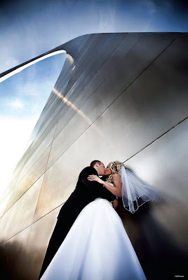 This pyramid shape dominates the image. It is, of course, the St. Louis Arch, the “Gateway to the West.” The way photographer Sal Cincotta photographed the scene, the arch’s top tails off into the pale blue sky, making an “S” curve at the top of the dominant shape.
TENSION AND BALANCE
Just as real and implied lines and real and implied shapes are vital parts of an effectively designed image, so are the “rules” that govern them: the concepts of tension and balance.
Balance occurs when two items, which may be dissimilar in shape or tone, create a harmony within the photograph because they are of more or less equal visual strength. Tension, on the other hand, is a state of imbalance in an image; it can be referred to as visual contrast. For example, placing a group of four children on one side of an image and a pony on the other side of the image will produce visual tension. They contrast each other because they are different sizes and they are not at all similar in shape.
Using the same example, these two different groups could be resolved visually if the larger group, the children, were wearing brightly colored clothes and the pony was dark. The eye would then see the two units as equal—one demanding attention by virtue of size, the other gaining attention by virtue of brightness.
Although tension does not have to be resolved in an image, it works together with the concept of balance so that, in any given image, there are elements that produce visual tension and elements that produce visual balance. This is a vital combination of artistic elements because it creates a sense of heightened visual interest. For this reason, both balance and visual tension are active ingredients in great portraiture.
SUBJECT TONE
The rule of thumb is that light tones advance visually, while dark tones retreat. Therefore, elements in the picture that are lighter in tone than the subject will be distracting. Of course, there are portraits where the subject is the darkest part of the scene—such as in a high-key portrait with a white background. This is really the same principle at work; the eye will go to the region of greatest contrast in a field of white or on a light-colored background. Regardless of whether the subject is light or dark, it should dominate the rest of the photograph either by brightness or by contrast.
A knowledge of the visual emphasis of tone should inform your discussions with portrait subjects about the selection of clothing for the session. For instance, darker clothing helps to blend bodies with the background, so that faces are the most prominent part of the photograph. Dark colors tend to slenderize, while light colors add weight. The color of the clothing should be generally subdued, since bright colors attract attention away from the face.
Buy this book from Amazon.


Thanks for sharing the information about the composition techniques.They may use the wedding planner android app and make full use of it.
ReplyDeleteThere are lots of composition techniques, in photography lots of techniques and designs would be there. Especially online wedding planner provide the service for wedding, wedding photographers give a reality to that wedding photos which are memorable.
ReplyDeleteThanks for this update. This will surely benefit many of your readers.
ReplyDeletewedding photographers
Amazing wedding photography with capturing good poses in all photographs.Thanks and keep posting
ReplyDeleteWedding photographers Melbourne
Nice information, for more information about Wedding photographer northampton
ReplyDeleteThank you for the info. It sounds pretty user friendly. I guess I’ll pick one up for fun. thank u.
ReplyDeleteLumini LED Panel
Thanking for giving nice information about Wedding photographer Northampton
ReplyDeleteThose guide are really important in posing and composition. As a south asian wedding photographer in toronto, you must be aware of those techniques in order for you to capture the best angle in the most artistic way.
ReplyDeletegrt
ReplyDeleteGood post, very nice and important information, thanks for sharing
ReplyDeletewedding photographer Orlando
Absolutley creative pose .The secret of any great portrait lies in the pose and expression.your subject look relaxed and natural.
ReplyDeletecheck out destination wedding photography in los angeles.
ou ought to have the capacity to put the greater part of your trust in your picture taker with the goal that your big day can be casual and agreeable. wedding pictures
ReplyDeleteGreat post full of useful tips! My site is fairly new and I am also having a hard time getting my readers to leave comments. Analytics shows they are coming to the site but I have a feeling “nobody wants to be first”.
ReplyDeleteWedding Photographer Melbourne VIC
Thanks for the post. It is really pleasure to hear this nice article blog.thanks for sharing with us.We at Fuel digital marketing give you the best eCommerce website development services in Chennai which will give you and your customers a one-stop solution and best-in-class services. We take your ideas and convert it into something simple and professional and that is what makes us one of the top-rated e-commerce development company in Chennai. We help you in gaining new marketing strategies, increase the range of your products which will, in turn, lead to the generation of more sales
ReplyDeletee commerce website development services in chennai | best woocommerce development company | best ecommerce website design company in coimbatore |ecommerce website designing company in chennai and coimbatore | opencart development company in coimbatore | opencart development company in chennai | woocommerce development company in chennai | woocommerce website designing company in chennai