Friday, December 2, 2011
Getting the Most Out of Bridal Shows
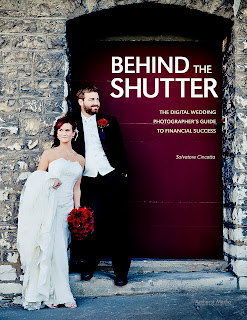
Today's post is an excerpt from the book Behind the Shutter: The Digital Wedding Photographer's Guide to Financial Success. It is available from Amazon.com and other fine retailers.
Now you have this wonderful business plan, but how do you get started booking weddings? Bridal shows are the best way to get your work out in front of a lot of brides very quickly. In addition, they allow you to begin networking with your industry peers. However, like all things, you need to have a plan. Just showing up with some prints and an album and expecting a windfall of cash . . . well, that borders on the realm of fantasy. Imagine your toughest job interview, then multiply it by ten. That will put you close to understanding the intensely competitive nature of a bridal show.
I get all sorts of feedback on the effectiveness of bridal shows. If you talk to ten photographers, somehow you’ll get ten different opinions on the subject. For us, bridal shows are the source of about 65 percent of our bookings. Yes, we have referrals, but bridal shows allow us to showcase our work to a much wider audience. I love them—I love the energy they bring, and I love being able to create a fan base for our work.
FINDING THE RIGHT SHOW
These days, bridal shows are like gas stations—they are everywhere. As a result, to a certain extent brides are getting burned out on them and becoming numb to the hard sell. Therefore, finding the right show is paramount, and defining “right” is equally important. Once you understand your target demographic and price points, you will have a good idea of your target bride. Is she the younger bride or the thirtysomething woman? Is she an elite bride spending $100,000 on her wedding or is she more in the mid-range? These are important questions to answer and should be part of your business and marketing plan.
Armed with this information, you will be better able to identify the right show for you. Start by doing a web search for shows in your area. I would be looking at the top ten to fifteen shows. Think about it this way: How are brides finding out about shows? I would bet that the majority of them are searching online. So if you can’t find the show online, how will they? Not every show will have a major web presence, but it certainly helps.
Now, take that list of shows and start reviewing their web sites to see if they have a section for vendors. There, you may find a media kit of sorts. In that media kit, you often have access to very valuable information—in particular, the demographics of their attendees. If not, pick up the phone and call the promoter. They are usually more than willing to talk to you about their show and what to expect.
If all else fails, ask other vendors what they think of the show. Be careful with this approach, though. A vendor’s success or failure at these events depends on many factors, including their ability to sell themselves and their product. So don’t just ask generic questions such as, “Did you like the show?” or “How many events did you book?” Instead, ask more specific and objective questions about how many brides attended, what the caliber of the brides was, etc.
One of the next things I tend to think about is attendance. I have been doing this long enough to know that with so many shows out there, getting the attention of the bride is not easy. And remember that pesky COA number we spoke about in the first chapter? The more brides that attend a show, the better your odds of booking more than one bride, and the better your COA number will be. (BLOG NOTE: As this blog post is an excerpt from a larger work, you will need to purchase the book to access chapter 1 and the information it contains.)
Also, how are the promoters advertising the show? Some of the larger shows are tied to a magazine. This is key for me; knowing that the magazine has a certain distribution assures me that the show should have a built-in audience. This is a good sign for sure.
Once you feel confident that the show is attracting the brides you want to book, the next thing to consider will be the price of admission. Not all shows and budgets are created equally. Our first year, we did several of the less expensive shows, and guess what? We booked low-budget, high-maintenance brides. Today, we focus more on the middle market. However, our pricing is on the higher end of the market for the Midwest. The reason I like to focus on the middle market is because it gives us access to the greatest number of brides. Brides who truly appreciate what we do will be willing to spend more on a photographer. Sure, we love our high-end clientele, but there is nothing more satisfying than working with a client who had to stretch a little to work with you because they love what you do.
In addition, we went from a single booth back in 2007 to a double booth at almost every show today. I love being able to showcase my work in a way that really stands out—and having that double booth really sets us apart from the rest.
GETTING PREPARED
Now that you have decided to participate in the show, the real fun begins. Preparing for a bridal show is never easy. In fact, I will never forget my first bridal show. I was so nervous that we would fail and our work would be rejected that I wanted to pull out the night before (and for anyone who knows me, confidence is not something I lack!). I don’t know what it was; I just had so much anxiety about the whole thing. My wife, being the amazing supporter that she is, pushed me to stick with it and, sure enough, it was a huge success for us. Within a week, we booked twelve weddings from that show. It was unreal and it opened my eyes to the impact these shows would ultimately have on our business and our future.
Displays and Samples. You have to understand your brides and understand what they are looking for. If they are going to shell out thousands of dollars to work with you, they want your creativity, energy, and artistic talent. And believe it or not, they often make up their minds about you within thirty seconds of setting foot in your booth. The way you dress, the pictures you are showcasing, your sample albums, the look and feel of your booth—these factors are all in play.
We want our clients to lust for our brand. We accomplish this by ensuring that everything we do is of the highest quality. We invest in having the right products to show. After all, you can’t sell it if you don’t show it. Don’t underestimate the importance that this will have on your overall success at the shows.
Here’s my first bit of advice: don’t show up at a bridal show with small prints. Remember, you are a photographer and you sell imagery! Every year, I see a new crop of photographers wanting to make it, and this is the one area where they all seem to fall flat on their faces. My feeling is that small images are something the client thinks they can produce on their own; they regard small prints more as snapshots than professional, high-quality images. Ask yourself: Are you trying to sell small images? Or do you want your potential clients to see you as an artist? Do you want them to fantasize about seeing themselves in one of your masterpieces? I sell vision. I sell art. I sell an experience. And none of that comes in an 8x10-inch package.
So go big! Make a statement and give them something to remember you by. Show them your top five or ten “statement” images—those shots that really get a bride to say, “Wow! I want that for my wedding day.” Yes, things like detail images are important to showcase in your overall portfolio, but I have never booked a bride who said, “Yep, that’s the best shoe photo I have ever seen. This guy is for me!”
Albums are one of the main products through which we differentiate ourselves from the competition. Therefore, we invest a lot of time and energy in ensuring that we have unique styles for brides to choose from. We carefully select styles that represent our brand and the overall design we are trying to sell. We are a very modern brand, so we strive for simplicity in our album designs—we don’t put 150 images in a twenty-page album. Because we don’t show albums designed this way, we don’t get clients who expect this. If you don’t have albums, go and make the investment. If you haven’t updated your samples in more than two years, guess what? It’s time to bite the bullet and get some new samples. There’s really no excuse; almost all album manufacturers make it simple for you to get an updated sample album at a 40 to 50 percent discount.
Your Attire. The last thing I want to cover regarding being prepared is your attire. I know it’s a strange thing to discuss in a business book, but the adage is true: you have to dress for success. Brides (at least the ones I’m going after) tend to be very fashion-oriented. If we want them to spend money and care about the way they look in pictures, we need to care how we look, too.
I am not suggesting you dress in a way that is not you. But, again, this is like a job interview. Yes, they are judging you and, yes, it’s pretty superficial. Trust me—I understand that our imagery is not tied to the way we dress. However, this is the world we live in and my goal is to remove any barrier that would prevent a couple from booking us. I want them to be able to relate to us and ultimately book us for their event.
WHAT TO EXPECT
Now that you are ready for the big show, you should have set some goals for yourself. We go into every show with reasonable expectations. At an average show, we want to book about four to five weddings to make the numbers work.
Understand Your Objectives. Going into the show, we know that it’s going to be intense, so we ratchet up the energy level. At one of the best shows in our area, there are about 1500 brides in attendance. I know one thing: I don’t want to book 1500 weddings. We are looking for approximately ten brides in the sea of couples—ten brides who get what we do, ten couples who identify with our brand and our style. This is a daunting task. We’re talking about homing in on less than 1 percent of the brides.
How do I focus in that tightly? I don’t. My hope is that all the work I did to prepare my booth will pay off by naturally attracting the right brides. Is that always the case? No, of course not—but it helps for sure. I have no idea who those “right” brides are or what they look like, so we treat every client who walks up like they are the only client there. There are two of us in the booth and we split up to ensure we are connecting with as many people as possible. And trust me when I tell you this: even if you don’t get to speak to someone one-on-one, they are hanging around in the background listening to your sales pitch. So make sure it’s solid.
Sell Yourself. In general, photographers are not salespeople and tend to be a little more introverted. If this is something you need to work on, be sure to do it. Practice—yes, I said practice. Talk to yourself in a mirror if you have to. Listen to yourself deliver your pitch. Does it sound natural or does it come off as rehearsed? Be honest with yourself or ask someone else to listen. Sure, it seems stupid—but I am an author, a lecturer, and an active photographer, and I still talk to myself. (I’m not sure what that says about me, but that’s another story.)
When I am talking about your sales pitch, I am not asking you to be super salesperson. You just have to be able to present your business effectively to someone in about thirty seconds. You need to tell them why they should choose you and what makes you different from every other photographer in the room. While no one may ask you those questions directly, you can bet that’s what it comes down to, so be sure your pitch clearly communicates your value proposition. (And now we have a new term: value proposition. This is a term used to describe the unique benefits you offer to prospective clients.)
Provide an Incentive. At some bridal shows, we like to collect names. To entice the brides to register, we have an item we are raffling off. It could be a free engagement session, a slide show, or some other product. Generally, brides are more than willing to give you this information—and some even come prepared with sticky labels that have all their information printed on them.
We have a big glass bowl and a sign-up pad where people can leave their information. This information is a gold mine for leads. We typically collect 150 to 300 names from a good show. We then use these leads to send out an e-mail blast to everyone who stopped by our booth. This keeps us fresh in their minds and usually generates another four to six meetings with brides.
JUMP IN!
Now, let’s get those fingers typing. Check for bridal shows in your local area and get ready to jump in with both feet. The first show will be your toughest, but if you invest the required time and money and do your homework, you will be well on your way to finding success in the wedding industry.
Buy this book from Amazon.
Labels:
Bridal Shows,
marketing,
Sal Cincotta,
wedding photography
Monday, October 17, 2011
Composition Techniques
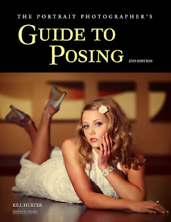
Today's post is an excerpt from the book The Portrait Photographer's Guide to Posing, 2nd Ed., by Bill Hurter. It is available from Amazon.com and other fine retailers.
SUBJECT PLACEMENT
Composition in portraiture involves proper subject placement within the frame. There are several schools of thought on proper subject placement, and no one school offers the only answer. Two formulas are given here to help you best determine where to place the main subject in the picture area.
The Rule of Thirds. Many a journeyman photographer doesn’t know where to place the subject within the frame. As a result, these less experienced artists usually opt for putting the person in the center of the picture. This is the most static type of portrait you can produce.
The easiest way to improve your compositions is to use the rule of thirds. This is a system that imposes asymmetry into the design of the portrait. According to the rule of thirds, the rectangular frame is cut into four imaginary lines that form a “tic-tac-toe” grid. The point at which any two of these lines intersect is considered an area of dynamic visual interest. The intersecting points are ideal spots at which to position your main point of interest, but you could also opt to place your point of interest anywhere along one of the dividing lines.
This applies to all print orientations. In a vertical print, the head or eyes are usually two-thirds up from the bottom edge of the image. Even in a horizontal composition, the eyes or face are usually in the top one-third of the frame.
The rule of thirds also applies equally to all portrait lengths. In head-and-shoulders portraits the eyes are the point of central interest. Therefore, it is a good idea if they rest on a dividing line or at an intersection of two lines. In a three-quarter- or full-length portrait, the face is the center of interest, so the face should be positioned to fall on an intersection or on a dividing line.
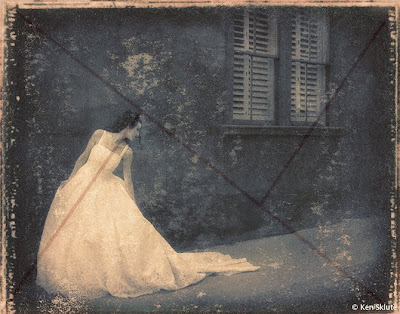
The Golden Mean. The golden mean, a concept first expressed by the ancient Greeks, is a compositional principle similar to the rule of thirds. Put simply, the golden mean identifies the point where the main center of interest should lie; it is an ideal compositional type for portraits. The golden mean is found by drawing a diagonal from one corner of the frame to the other. Then, draw a line from one (or both) of the remaining corners so that it intersects the first line perpendicularly. By doing this you can determine the proportions of the golden mean for both horizontal and vertical photographs.
With the overlay, you can see how effectively the golden mean is incorporated into this portrait by Ken Skute.
DIRECTION
Regardless of which direction the subject is facing in the photograph, there should be slightly more room in front of the person (on the side toward which he is facing). For instance, if the person is looking to the right as you look at the scene through the viewfinder, then there should be more space to the right side of the subject than to the left of the subject in the frame. This gives the image a visual sense of direction. Even if the composition is such that you want to position the person very close to the center of the frame, there should still be slightly more space on the side toward which the subject is turned.
The same compositional principle also applies when the subject is looking directly at the camera. Rather than centering the subject in the frame, you should leave slightly more room on one side to create a sense of direction within the portrait.
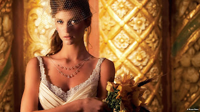
This image by Bruce Dorn is intersected by vertical lines in the background, yet they do not cut the image in half or in thirds. Instead, they act as contrasting elements to the diagonal lines spread throughout the background and also the diagonal lines within the bride’s veil and dress.
LINES
Mastering composition and posing requires an ability to recognize real and implied lines within the photograph. A real line is one that is obvious—the horizon or a door frame, for example. An implied line is one that is not as obvious, like the line created on the face by the eyes.
Position of Lines. Real lines should not run across the center of the frame. This actually splits the composition into halves. It is better to position real lines at a point one-third of the way into the photograph. This weights the photograph more interestingly.
At the Edge of the Frame. Lines, real or implied, that meet the edge of the photograph should lead the eye into the scene and not out of it. Additionally, they should lead toward the subject. A good example of this is the country road that is widest in the foreground and converges to a point where the subject is walking. These lines lead the eye straight to the subject.
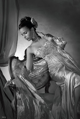
In this dramatic pose, the subject’s body forms almost countless diagonal lines—and a sweeping S curve running vertically through the frame. Notice how everything leads your eye directly to her face. Photograph by Robert Lino.
Implied Lines. Implied lines, such as those of the arms and legs of the subject, should not contradict the direction or emphasis of the composition, but should modify it. These lines should feature gentle changes in direction and lead to the main point of interest—either the eyes or the face. There should also be some sort of inherent logic in the arrangement of elements within the image that causes the eye to follow a predetermined path. This is a key element in creating visual interest and staying power.
PLEASING COMPOSITIONAL FORMS
Lines in compositions provide visual motion. The viewer’s eye follows the curves and angles of these forms as it travels logically through them, and consequently, through the photograph. The recognition and creation of compositional lines, often through posing, is a powerful tool for creating a dynamic portrait.
The S-shaped composition is perhaps the most pleasing of all the forms. In images that employ this shape, the center of interest will usually fall on or near one of the intersections established by the rule of thirds or golden mean, but the remainder of the composition will form a gently sloping S shape that leads the viewer’s eye to this area of main interest. Another pleasing type of composition is the L shape or inverted L shape. This type of composition is ideal for either reclining or seated subjects. The C and Z shapes are also seen in all types of portraiture and are both visually pleasing.
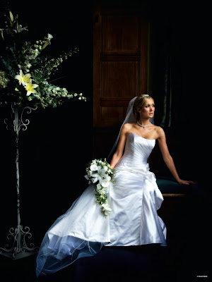
The S curve is one of the most pleasing of all compositional forms. You can see the
S shape subtly interwoven into this bride’s pose. Photograph by Stuart Bebb.
SHAPE
Shape is nothing more than a basic geometric shape found within a composition. Shapes are often made up of implied or real lines. For example, a classic way of posing three people is in a triangle or pyramid shape. You might also remember that the basic shape of the body in any well-composed portrait creates a triangular base. Shapes, while more dominant than lines, can be used similarly in unifying and balancing a composition.
The classic pyramid shape is one of the most basic in all art and is dynamic because of its use of diagonals with a strong horizontal base. The straight road receding into the distance is a good example of a found pyramid shape.
Sometimes shapes may also be linked, sharing common elements in both of the groups. For example, a single person in between can link two groups of three people posed in pyramid shapes, a common technique in posing group portraits.
There are an infinite number of possibilities involving shapes and linked shapes and even implied shapes, but the point of this discussion is to be aware that shapes and lines are prevalent in well-composed, well-posed images and that they are vital tools in creating strong visual interest within a portrait.
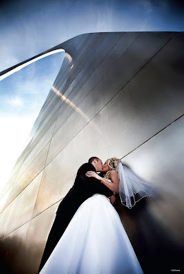
This pyramid shape dominates the image. It is, of course, the St. Louis Arch, the “Gateway to the West.” The way photographer Sal Cincotta photographed the scene, the arch’s top tails off into the pale blue sky, making an “S” curve at the top of the dominant shape.
TENSION AND BALANCE
Just as real and implied lines and real and implied shapes are vital parts of an effectively designed image, so are the “rules” that govern them: the concepts of tension and balance.
Balance occurs when two items, which may be dissimilar in shape or tone, create a harmony within the photograph because they are of more or less equal visual strength. Tension, on the other hand, is a state of imbalance in an image; it can be referred to as visual contrast. For example, placing a group of four children on one side of an image and a pony on the other side of the image will produce visual tension. They contrast each other because they are different sizes and they are not at all similar in shape.
Using the same example, these two different groups could be resolved visually if the larger group, the children, were wearing brightly colored clothes and the pony was dark. The eye would then see the two units as equal—one demanding attention by virtue of size, the other gaining attention by virtue of brightness.
Although tension does not have to be resolved in an image, it works together with the concept of balance so that, in any given image, there are elements that produce visual tension and elements that produce visual balance. This is a vital combination of artistic elements because it creates a sense of heightened visual interest. For this reason, both balance and visual tension are active ingredients in great portraiture.
SUBJECT TONE
The rule of thumb is that light tones advance visually, while dark tones retreat. Therefore, elements in the picture that are lighter in tone than the subject will be distracting. Of course, there are portraits where the subject is the darkest part of the scene—such as in a high-key portrait with a white background. This is really the same principle at work; the eye will go to the region of greatest contrast in a field of white or on a light-colored background. Regardless of whether the subject is light or dark, it should dominate the rest of the photograph either by brightness or by contrast.
A knowledge of the visual emphasis of tone should inform your discussions with portrait subjects about the selection of clothing for the session. For instance, darker clothing helps to blend bodies with the background, so that faces are the most prominent part of the photograph. Dark colors tend to slenderize, while light colors add weight. The color of the clothing should be generally subdued, since bright colors attract attention away from the face.
Buy this book from Amazon.
Tuesday, August 9, 2011
Four Types of Engagement Sessions
Today's post is an excerpt from the book Engagement Portraiture: Master Techniques for Digital Photographers, by Tracy Dorr. It is available from Amazon.com and other fine retailers.
When planning an engagement session, you will have many stylistic options available to you. No matter what style you choose, however, you will have two main avenues for executing it: a formal approach or an informal approach. Although the formal session is usually shot in a more traditional studio setting, I suggest that you try to think more broadly of “formal” as your approach to dealing with the customers. The same goes for the “informal”approach.
Choose your location wisely. Traditionally, formal shoots often take place in a studio setting with lights and backdrops. Pose your couple carefully and pay attention to everything from posture to hand positioning and hairstyling. You have total control in these situations, so take advantage of that. Photograph by Nicole Knauber.
FORMAL
The classic, traditional engagement photo is a formal portrait. In the 1800s, portraits were necessarily serious and formal due to the extremely long exposure times that were required by the photographic technologies of the day. As higher film speeds became available, portraits took on a somewhat happier vibe; the subjects were smiling and more comfortable, but still formal and looking directly into the camera. Since the digital revolution, photojournalism has deeply impacted the style of portraits clients desire, but there is still a large market for a more formal approach to an engagement portrait. If your clients are interested in a more formal approach, or if you are more comfortable shooting that way, you will need to decide if the session will be done in a studio setting with multiple backdrops or props, or if you will go on location. Formal shoots are typically created in a studio sitting, but if you do choose to go on location, think about more formal locations—like a church or museum, as opposed to a beach or heavily urban setting that will define your shoot before you even begin. The location you choose will directly impact the formal mood of your photos.
Formal sessions are not limited to a studio setting. Creativity may lead you to an unusual location that fits the couple’s personality. Scout out the location to make sure it will enhance the formal mood, not detract from it. Photograph by Evan Laettner.
When posing your couple, make sure to look for every flattering nuance and try out several different poses. They should generally be looking into the camera and their body language should be less relaxed. Think of an upright posture, folded hands, turned-in bodies, and seated or standing shots. Their bodies and faces should be angled toward the camera, not straight-on like a mug shot. Even though you don’t need as many exposures for formal portraits as you would for a more candid session, you still have the opportunity to use the digital media to your advantage. Keep shooting. Feel free to experiment with as many different poses and combinations as you like.
You can always choose only the best one or completely delete anything that didn’t work. Ultimately, you are ensuring that the couple will have more selection in the end. Clients looking for a formal sitting will be more detail-oriented and will be looking for perfection. You don’t have the same kind of creative liberty to make artistic “errors” as you do in photojournalistic portraits.
INFORMAL
An informally styled engagement session can either be posed in a relaxed manner or it could take place as a totally photojournalistic shoot. You can also develop a combination of the two if you are skilled at directing and interacting with your clients. If your studio’s shooting area is limited in size, these types of sessions may work better on location. Additionally, the more relaxed atmosphere of an outdoor setting alleviates the stiffness of a traditional studio setting, something that is integral to a more informal approach. A session that is still traditionally posed but executed in a more relaxed, informal manner is the most widely accepted type of session today. In this type of session, the clients may still be rather traditionally posed, but you will develop the poses as you go. You should give the clients direction and talk them through each pose, but allow them to be comfortable and to be themselves. This contrasts with a purely photojournalistic type of session, in which you provide little or no posing direction but concentrate, instead, on capturing your clients as they really are.
Informally posed sessions are a popular choice. They allow you to modernize an old concept and flatter any couple or location. Photograph by Evan Laettner.
Informal sessions differ from photojournalistic ones because you will still be giving direction throughout the shoot. You may say, “Hold hands and walk toward me,” or “Put your hand on his cheek” in order to achieve the desired result. The clients will
have some room to experiment and act on impulse, but you maintain control by giving direction. You are not trying to achieve technical perfection with these poses, just create a nice moment with excellent lighting, an attractive background, and an appealing overall mood. Photograph by Evan Laettner.
ADDRESSING WARDROBE
The couple will decide for themselves what they want to wear for their engagement shoot, but you may find yourself in the position to give advice. They may call and ask your opinion, show up with several outfits and ask you to choose, or you may be more proactive and recommend certain choices to them in advance. If they show up with several choices, consider what outfits will best fit the mood and style of your location. (Asking which is their favorite is never a bad idea either.) If you are in conversation with them prior to the shoot, begin with a series of questions. “What style are we going for with this shoot?” “Where would you like to do it?” “Do you want to be relaxed and be yourself, or are you looking to do something different that you ordinarily wouldn’t do?” If the answer to that is yes, then ask, “Are we thinking more fashion-forward?” “Totally uninhibited and creative?” “Textured and urban inspired?” Depending on their answers, you should be able to decide between the five-inch heels or sandals and between evening wear or jeans. For example, if you plan to shoot in the forest or in a park setting, high heels will dig into the soft ground and a very short, tight skirt will not allow the woman to conveniently sit or crawl up onto something. (This is especially important if you are shooting in a place that carries potential risks, like a junkyard or back alley.) If you are shooting on a city sidewalk, or in a theater, or at a museum, then go for the heels.
Let the couple’s personal style influence how you shoot and what angles you choose. Photograph by Kelly Moore. What if the walk to your location is long and the woman’s shoes are acutely uncomfortable? That would be wise to discuss in advance. If the couple wants to be experimental, then comfort is a must. They must be able to do anything that comes to mind and experiment with wild poses or locations. The type of wardrobe the couple chooses will also directly define the mood of your photographs. If the wardrobe completely compliments the location you chose, then the finished product will be incredibly cohesive. Encourage them to tell a story with their outfits and showcase their own personalities.
Sometimes an unexpected mix of two opposite things creates a unique vibe in your image. Formal attire in the desert would not be everyone’s first choice, but here Dave and Quin Cheung demonstrate that two contradictory styles create one highly fashionable and impactful image. The style, location, delicate posing and bold red color all work together seamlessly and tell one really intriguing story.
Wednesday, July 6, 2011
Lighting Fundamentals for Small Flash
Today's post is an excerpt from the book Small Flash Photography, by Bill Hurter. It is available from Amazon.com and other fine retailers.
The Color of Light
The color of light affects the way colors are recorded in a scene and is, therefore, of concern to all professional photographers. The color of light is measured in degrees Kelvin, based on a system devised in the 1800s by British physicist William Kelvin. Kelvin heated a dense block of carbon and noted that, at different temperatures, it emitted a repeatable and measurable color of light. The particular color of light seen at a specific temperature is now called the color temperature. When the carbon, also known as a “black body radiator,” is hot enough and just begins to emit light, it is dull red. As more heat is applied, it glows yellow, and then white, and finally blue.
Electronic flashes also have specific color temperatures. For example, the color of the light emitted by a flash may be rated at 5500K when it is designed to imitate noon daylight. If the flash produces light that is 6000K, it will be on the cool (bluish) side. If it is rated at 4800K degrees, it is slightly warmer (more yellowish) than white light.
Jeff Kolodny combined at least three different light sources in the scene to make a beautiful bridal formal. The doorway was lit by dim daylight with a blue tinge, while the room light was a combination of much warmer light from the chandeliers and other room lights. Jeff also popped a camera-mounted flash at less intensity than the daylight to help warm up the color balance and add a sparkle to the bride’s eyes.
Custom White Balance
When combining ambient light sources with flash, a custom white-balance reading should be taken. You may have room-lamp brightnesses to contend with, as well. Your best bet in these situations is to shoot a few test frames with flash and ambient combined to see where your white balance is. Then perform a custom white balance procedure to balance all of the light sources harmoniously. Alternatively, shoot in RAW capture mode, which will allow you to fine-tune the color balance after capture. The following is a resource for determining color temperatures in Kelvin degrees in the most popular lighting situations. These readings correspond to your menu settings for white balance and are provided in order to give you an insight into the Kelvin settings of most DSLRs.
The natural shade of late afternoon is very soft but lacks sparkle. To give the light a little extra snap, the photographer, JB Sallee, fired an on-camera flash that was set to output at two stops less than the daylight. The effect is exactly what the photographer intended.
Subscribe to:
Posts (Atom)