Tuesday, March 26, 2013

Video Light Wedding Portraits


Today's post is an excerpt from the book Direction and Quality of Light, by Neil van Niekerk. It is available from Amazon.com and other fine retailers.

For that dramatic, Hollywood look, a video light is probably the
easiest thing to use—especially when you need to work quickly,
like on a wedding day. With Allison and Scott’s wedding, the
majority of their romantic portraits (plates 11-7 through 11–10)
were taken using only a single video light, the Lowel ID-Light.
For this shoot, I chose to work with the Lowel ID-Light, instead
of the LitePanels MicroPro LED video light, because I wanted a
video light that was stronger. I also wanted the ability to diffuse
or focus the light, depending on what I needed. It was just the
more flexible choice for this event.
 

As you can see by the camera settings for these images, I
needed to work at high ISO settings and wide apertures. This is
because video lights are generally used in lower levels of ambient
light where the look of the rapid falloff gives the lighting a
dramatic look—and provides a lot of control. For example, in
the passageway seen in plate 11-8, the opposing mirrors gave an
infinity effect. The video light was ideal here for containing the
light spill; it’s basically what made this image possible. I could
have created the same image with flash, but it would have been
difficult to do it in the short time available.


Plate 11-7—Most of Allison and Scott's romantic portraits were created using a single video light. Exposure: 1/50 second, f/2.8, 1250 ISO, Lens: 24–70mm f/2.8 lens. Lowel ID-Light.


Plate 11-8—The controlled spread of the video light was useful in this mirrored hallway. Exposure: 1/30 second, f/3.2, 1600 ISO. Lens: 24-70mm f/2.8. Lowel ID-Light.


For plates 11-9 and 11-10, I turned down the brightness of
the video light to hold the detail in the background. If I had used
a brighter light on the couple, I would also have had to use a
faster shutter speed, smaller aperture, or lower ISO, which would
have made the background go darker—or even black.


As can be seen in plates 11-11 and 11-12, images of Tatiana
and Brandon at their wedding, the dramatic look of video light
works beautifully with black & white photographs. If I had
wanted to ease the contrast and bring in more shadow detail, it
would simply have been a matter of bouncing my on-camera flash
behind me. This would have to be done with the FEC turned
way down—to around –3EV—so that it just acted as a fill light.
The flash would also have to be gelled with a CTS or CTO gel to
avoid introducing a blue tint to the fill light.


Plates 11-9 and 11-10—Reducing the intensity of the video light enabled me to hold the detail in the dark backgrounds. Exposure: 1/30 second, f/3.2, 1600 ISO, 24–70mm f/2,8 lens. Lowel ID-Light.


Plates 11-11 and 11-12—Video light works beautifully for black & white images. Exposure: 1/60 second, f/3.2, 1600 ISO, Lens: 24–70mm f/2.8. Litepanels MicroPro LED video light.


Buy this book from Amazon.com.

Saturday, February 9, 2013

Types of Engagement Portraits


Today's post is an excerpt from the book Engagement Portraiture, by Tracy Dorr. It is available from Amazon.com and other fine retailers.


When planning an engagement session, you will have many stylistic options available to you. Those will be explored further in the next chapter. No matter what style you choose, however, you will have two main avenues for executing it: a formal approach or an informal approach. Although the formal session is usually shot in a more traditional studio setting, I suggest that you try to think more broadly of “formal” as your approach to dealing with the customers. The same goes for the “informal” approach.


FORMAL
The classic, traditional engagement photo is a formal portrait. In the 1800s, portraits were necessarily serious and formal due to the extremely long exposure times that were required by the photographic technologies of the day. As higher film speeds became available, portraits took on a somewhat happier vibe; the subjects were smiling and more comfortable, but still formal and looking directly into the camera. Since the digital revolution, photojournalism has deeply impacted the style of portraits clients desire, but there is still a large market for a more formal approach to an engagement portrait.

If your clients are interested in a more formal approach, or if you are more comfortable shooting that way, you will need to decide if the session will be done in a studio setting with multiple backdrops or props, or if you will go on location. Formal shoots are typically created in a studio sitting, but if you do choose to go on location, think about more formal locations—like a church or museum, as opposed to a beach or heavily urban setting that will define your shoot before you even begin. The location you choose will directly impact the formal mood of your photos. 


Choose your location wisely. Formal shoots often take place in a studio setting with lights and backdrops. Pose the couple carefully, and pay attention to every detail—from hand posing to hairstyling. You have total control in these situations, so take advantage of that. Photo by Nicole Knauber.

When posing your couple, make sure to look for every flattering nuance and try out several different poses. They should generally be looking into the camera and their body language should be less relaxed. Think of an upright posture, folded hands, turned-in bodies, and seated or standing shots. Their bodies and faces should be angled toward the camera, not straight-on like a mug shot. 


Formal sessions are not limited to a studio setting. Creativity may lead you to an unusual location that suits the couple's personality. Scout out the location to make sure it will enhance the mood, not detract from it. Photo by Evan Laettner.


Even though you don’t need as many exposures for formal portraits as you would for a more candid session, you still have the opportunity to use the digital media to your advantage. Keep shooting. Feel free to experiment with as many different poses and combinations as you like. You can always choose only the best one or completely delete anything that didn’t work. Ultimately, you are ensuring that the couple will have more selection in the end. Clients looking for a formal sitting will be more detail-oriented and will be looking for perfection. You don’t have the same kind of creative liberty to make artistic “errors” as you do in photojournalistic portraits.

INFORMAL
An informally styled engagement session can either be posed in a relaxed manner or it could take place as a totally photojournalistic shoot. You can also develop a combination of the two if you are skilled at directing and interacting with your clients. If your studio’s shooting area is limited in size, these types of sessions may work better on location. Additionally, the more relaxed atmosphere of an outdoor setting alleviates the stiffness of a traditional studio setting, something that is integral to a more informal approach. 

A session that is still traditionally posed but executed in a more relaxed, informal manner is the most widely accepted type of session today. In this type of session, the clients may still be rather traditionally posed, but you will develop the poses as you go. You should give the clients direction and talk them through each pose, but allow them to be comfortable and to be themselves. This contrasts with a purely photojournalistic type of session, in which you provide little or no posing direction but concentrate, instead, on capturing your clients as they really are. 


During your initial meeting with the clients, educate them about informal and photojournalistic approaches. See which one they are truly looking for. They may be confused as to the difference. 

Informally posed sessions are a popular choice. They allow you to modernize an old concept and flatter any couple or location. Photo by Evan Laettner.


Buy this book from Amazon.com.


Friday, November 30, 2012

Effective Strategies for Posing Wedding Groups

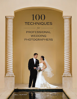
  Today's post is an excerpt from the book 100 Techniques for Professional Wedding Photographers, by Bill Hurter. It is available from Amazon.com and other fine retailers.


Tip # 30. Photographing Larger Groups

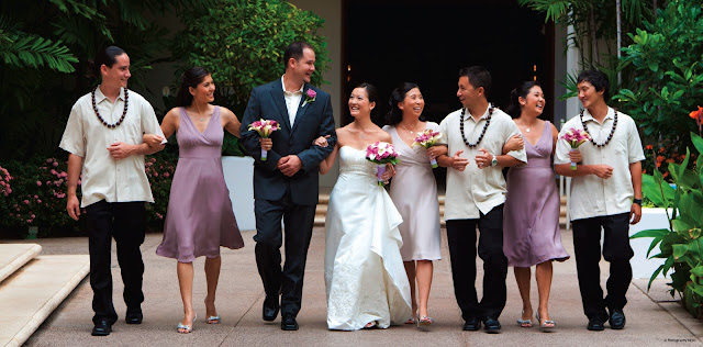
As people gather for large group portraits, have them put their drinks down before they enter the staging area, then arrange the group so that the bride and groom are the center of interest and everyone else’s face can be seen (tell everyone that they need to be able to see you with both eyes to be seen in the photo). Look for a high vantage point, such as a balcony or second-story window, from which you can make the portrait. You can also use your trusty stepladder, but be sure someone holds it steady—particularly if you’re at the very top. Use a wide-angle lens and focus about a third of the way into the group, using a moderate taking aperture to keep everyone sharply focused. Another trick is to have the last row in a group lean in while having the first row lean back, thus creating a shallower subject plane, making it easier to hold the focus across the entire group.


This is the “bouquet of flowers” treatment for groups. Shooting from directly above to capitalize on the symmetry of the composition, Dan Doke created a beautiful portrait of the bride and her maids. Using an 85mm lens, the perspective is good and normal. With a wide-angle lens, faces this close to the frame edges would have been distorted. 


Tip #31. Speeding Up Your Group Portraits


The best man and ushers can usually be persuaded to help organize large group photos. Be sure to have everyone make it sound like fun—it should be. One solution is to make your formal groups at the church door as the couple and bridal party emerge. Everyone in the wedding party is present and the parents are nearby. If you don’t have a lot of time to make these groups, this is a great way to get them all at once—in under five minutes. 


Tip #32. Control the Focus Field

Adjust the Camera Angle. With large groups, raising the camera height and angling the camera downward keeps the film plane more parallel to the plane of the group’s faces. Doing this does not change the depth of field, but it optimizes the plane of focus to accommodate the depth of the group. This makes it possible to get both the front and back rows in focus.

Adjust the Subject Distance. If your subjects are in a straight line, those at the ends of the group will be proportionately farther away from the lens than those in the middle of the lineup (unless you are working at a great distance from the subjects). As a result, those farthest from the lens will be difficult to keep in focus. The solution is to bend the group, having the middle of the group step back and the ends of the group step forward so that all of the people are at the same relative distance to the camera. To the camera, the group will still look like a straight line, but by distorting the plane of sharpness you will be able to accommodate the entire group.


Ben Chen used a beautiful spiral staircase as the framework for this formal wedding portrait. He lit the scene with his on-camera 580EX strobe bounced into the ceiling. Notice how each person in the group looks great—even the little ones. 


This is a fun group shot of a huge wedding party done by JB Sallee. Titled Jump, Damn It!, this is a straight-line composition. The group has a good dynamic created by the fact that over half of the group could not take directions very well. The up-and-down head heights produces its own kind of dynamic line that seems to work in this composition.


Tuesday, September 25, 2012

Corrective Posing for Weddings


Today's post is an excerpt from the book Master Posing Guide for Wedding Photographers, by Bill Hurter. It is available from Amazon.com and other fine retailers.
It's important to understand that people don't see themselves the way they actually appear. Subconsciously, they shorten their noses, imagine they have more hair than they really do, and in short, pretend they are better looking than they really are. A good portrait artist knows this and knows how to reflect the same level of idealization in portraits of the subject. As a matter of procedure, the photographer analyzes the face and body and makes mental notes as to how to best light, pose, and compose the subject to produce a flattering likeness. Because they are always shooting under pressure, wedding photographers must master these techniques to such a degree that they become second nature.


Camera Height and Perspective

Camera Height.
When photographing people with average features, there are a few general rules that govern camera height. These rules will produce normal perspective with average people.

When the perfect camera height for a head-and-shoulders portrait is used, the face is well proportioned and oval—as shown here.

• For head-and-shoulders portraits, the rule of thumb is that camera height should be the same height as the tip of the subject’s nose or slightly higher.

• For three-quarter-length portraits (portraits that include the subject’s figure down to mid-calf or mid-thigh), the camera should be at a height midway between the subject’s waist and neck. 

• In full-length portraits, the camera should be the same height as the subject’s waist. 

In each case, notice that the camera is at a height that divides the subject into two equal halves in the viewfinder. This is so that the features above and below the lens/subject axis are all the same distance from the lens and thus recede equally for “normal” perspective. 

Controlling the Perspective
As the camera is raised or lowered, the perspective (the size relationship between parts of the photo) changes. By controlling perspective, you can alter the physical traits of your subject.

By raising the camera height in a three-quarter or full-length portrait, you enlarge the head and shoulder regions of the subject, while slimming the hips and legs. Conversely, if you lower the camera, you reduce the size of the head and enlarge the size of the legs and thighs. If you find that after you make a camera-height adjustment for a desired effect there is no change, move the camera in closer to the subject and observe the effect again.

Tilting the camera down when raising the camera (and up when lowering the camera) increases these effects. A good rule of thumb for three-quarter- and full-length portraits is to keep the lens at a height where the plane of the camera’s back is parallel to the plane of the subject. If the camera is tilted up or down you will be distorting the person’s features. 

When you raise or lower the camera in a head-and-shoulders portrait, the effects are even more dramatic. Raising or lowering the camera above or below the subject’s nose height is a prime means of correcting any facial irregularities. Raising the camera lengthens the nose, narrows the chin and jaw lines, and broadens the forehead. Lowering the camera shortens the nose, de-emphasizes the forehead, and widens the jaw while accentuating the chin.

Correcting Specific Problems
Overweight Subjects
Dark clothing will make a person appear ten to fifteen pounds slimmer. While this is is something you could recommend for the engagement session, it’s beyond your control at the wedding. Therefore, careful posing will be an important tool for addressing the issue. Begin by using a pose that has the subject turned at a 45-degree angle to the camera. Never photograph a larger person head-on; it will only accentuate their size. Standing poses are more flattering for overweight subjects. Seated, excess weight accumulates around the waistline. Selecting a pose that turns your subject away from the main light is also desirable, as this will put more of the body in shadow and produce a slimming effect.

Thin or Underweight Subjects
When posing a thin person, have him or her face the camera more directly to provide more width. Selecting a pose that turns your subject toward the main light is also desirable, as this will put more of the body in the light and produce a widening effect.

Elderly Subjects

The older the subject, the more wrinkles he or she will have. It is best to use some type of diffusion, but do not soften the image to the point that none of the subject’s wrinkles are visible. Men, especially, should not be overly softened, as their wrinkles are often considered “character lines.” In the absence of light modifiers, you can also pose the subject so that the main light strikes primarily the front of their face, minimizing any deep shadows in the wrinkles and deep furrows of the face. 

In general, older subjects should also be smaller within the composition. Even when making a head-and-shoulders portrait, reducing the subject size by about 10–15 from how you might normally frame the image will ensure that the signs of age are less noticeable.


A good rule of thumb when making a three-quarter-length portrait is to keep the camera back parallel to the subject plane. This reduces subject distortion and helps keep horizontal and vertical lines true.

Eyeglasses
With digital capture, it’s easy to see if eyeglasses are captured with reflections. If you have a chance to retake the photo, have the person slide the eyeglasses down on his or her nose slightly. This changes the angle of incidence and helps to eliminate unwanted reflections.

One Eye Smaller than the Other

Most people have one eye smaller than the other. This should be one of the first things you observe about your subject. If you want both eyes to look the same size in the image, pose the subject in a seven-eighths to three-quarters view, placing the smaller eye closer to the camera. Because objects farther from the camera look smaller and nearer objects look larger, this will cause both eyes to appear to be more or less the same size.

Baldness

If your subject is bald, lower the camera height so less of the top of his head is visible. In post-production, you can also try to blend the tone of the background with the top of your subject’s head.

Double Chins

To reduce the view of the area beneath the subject’s chin, raise the camera height so that area is less visually prominent. You can also have the subject tilt their chin upward, tightening the area, and (if possible) raise the main light so that as much a possible of the area under the chin is in shadow.

Wide Faces

To slim a wide face, pose the person in a three-quarters view and turn them away from the main light. This places the image highlights on the narrow side of the face for a slimmer look.

Thin Faces

To round a narrow face, pose the person in a seven-eighths view, keeping as much of the face as possible visible to the camera. Turn them toward the main light to place the image highlights on the broader side of the face for a fuller look.

Broad Foreheads

To diminish a wide or high forehead, lower the camera height and tilt the person’s chin upward slightly. Remember, the closer the camera is to the subject, the more noticeable these corrective measures will be. If you find that by lowering the camera and raising the chin, the forehead is only marginally smaller, move the camera in closer and observe the effect again—but watch out for other distortions.

Deep-Set and Protruding Eyes

To correct deep-set eyes, try having the subject raise their chin. To correct protruding eyes, have the person look downward so that more of the eyelid is showing.

Large Ears

To scale down large ears, the best thing to do is to hide the far ear by placing the person in a three-quarters view, making sure that the far ear is out of view of the camera (or in shadow). If the subject’s ears are very large, examine the person in a profile pose. A profile pose will totally eliminate the problem. Also, longer length lenses will appear to compress the visible ear, reducing its prominence.

Uneven Mouths

If your subject has an uneven mouth (one side higher than the other, for example) or a crooked smile, turn his or her head so that the higher side of the mouth is closest to the camera, or tilt the subject’s head so that the line of the mouth is more or less even.

Long Noses and Pug Noses

To reduce the appearance of a long nose, lower the camera and tilt the chin upward slightly. You should also select a frontal pose, either a full-face or seven-eighths view, to disguise the length of your subject’s nose.

Long Necks and Short Necks

While a long neck can be considered sophisticated, it can also appear unnatural—especially in a head-and-shoulders portrait. By raising the camera height and lowering the chin you will shorten an overly long neck. When photographing a male subject, pulling up his collar will also shorten an overly long neck. Conversely, lowering the camera height and suggesting a V-neck shirt (for the engagement session, for example) will lengthen the appearance of a short neck.

Wide Mouths and Narrow Mouths

To reduce an overly wide mouth, photograph the person in a three-quarters view with no smile. For a narrow or small mouth, photograph the person in a more frontal pose and have him or her smile broadly.

Long Chins and Stubby Chins

Choose a higher camera angle and turn the face to the side to correct a long chin. For a stubby chin, use a lower camera angle and photograph the person in a frontal pose.


Tuesday, August 21, 2012

Posing the Bride, Groom and Couple


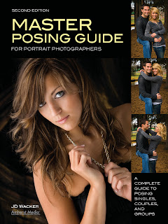
Today's post is an excerpt from the book Master Posing Guide for Portrait Photographers, 2nd Ed. by JD Wacker. It is available from Amazon.com and other fine retailers.

PSYCHOLOGY
Love Is in the Air. More than any other type of portraiture, wedding portraits should capture the love between the bride and the groom and from their family and friends. Certainly, recording images of groups and events on the big day is essential. But it shouldn’t overshadow the opportunity for you to create images that show love. Everyone is dressed in their best clothing, happy (well, usually), and having fun. Make the most of it. Be creative and be prepared to capture special moments that just happen and are nearly impossible to re-create.

Mutual Respect. Conduct yourself as a professional and let your subjects know they are important to you. Let them know that you want to create fantastic images that they will treasure forever, but don’t want to interfere with their wedding day. Have a plan and let them know what it is. They will respect you and be
more cooperative. It will be a win–win situation.

Keep Your Cool. Wedding Photographer Horror Stories could be the next best-selling thriller or reality show. Expect anything to happen and be ready to adapt. Make it clear that you are trying to do your best for them, but don’t argue or be agitated. Many of the people involved have a lot time invested and little sleep. So, be understanding. Also, be aware that many of the attendants won’t know what’s going on and may see you in a bad light.


Be creative, have fun, and be ready to capture images that reflect the unique character of the bride and groom.


MECHANICS
The Bride. Pose the bride as you normally would pose a woman, and make the dress and accessories work to your benefit, not against you. Accentuate the long, flowing, graceful lines of the veil and train. Define the waistline by separating the arms and the body and by twisting the body at the waist. If the bride is holding a bouquet, position it in the hand farthest from your main light source and slightly above waist level for three-quarter  and full-length portraits. With the other hand, try more formal, dance-like poses of the bride’s hands by bending the hand away from the body at the wrist, showing the edge of the hand, and elongating the fingers. Turn the bride away from the main light source to maximize dress detail.

The Groom. Again, it is the unique clothing that will provide new posing opportunities. Suits and tuxedos are more restrictive to movement, but encourage straighter posture that invokes a feeling of positive attitude. Use this attitude to your advantage. You’ll capture more dynamic images of the man, simply because he is more excited and more sure of himself as a subject.

The Bride and Groom. As opposed to most portrait sessions where you must build up the energy level, at a wedding all you need to do is be ready for it to happen. You can guide the couple into poses that encourage their natural interaction. As with any couple, the combination of the bride in a graceful S-pose and the groom in the strong C-pose will add artistic value to the portrait. Just have them look at each other and hold each other, or have the bride look at her ring or flowers and have the groom look at her. At these points, their expressions will be genuine and full of love. If you get them involved with their parents, the wedding party, and the guests, special moments will arise for you to record in wonderful portraits.


Guide the couple into natural poses than encourage interaction.


The Wedding Party and Families. The number of people involved at a wedding can be astronomical. You can’t expect all of them to feel well and be excited about having their portrait taken. Work quickly and efficiently, but still pay attention to detail. An assistant can be very helpful when posing groups. One of you can handle the camera and lighting while the other arranges the individuals and helps them pose. Order of importance and height are two major factors when arranging groups at a wedding. Place the most important individuals closest to the bride and/or groom. Sort individuals and couples by height to ensure that everyone is seen and has his own space and that the group is balanced as a whole. The bride and groom are obvious centers of interest and can serve as the focal point in a more interactive style of portrait.


Whrranging group shots, place the most important individuals closest to the bride and  groom.


Buy this book from Amazon.com.


Monday, July 16, 2012

Working with Reflectors


Today's post is an excerpt from the book Doug Box's Available Light Photography: Techniques for Digital Photographers. It is available from Amazon.com and other fine retailers.


REFLECTORS
Photographers use reflectors to bounce light onto the subject or scene. They are available in different sizes and with various surfaces that can be used to intentionally affect the color of the light, making it warmer or cooler.


I use reflectors in many ways—to fill in the shadow side of a subject, as a main light, as a kicker light or rim light, set opposite the main light to add roundness or create tonal separation, to illuminate the background, and more.


Typically I use either a 32-inch round pop-up reflector or a 42-inch Scrim Jim with a reflective panel. However, almost any material with a reflective surface can be used as a reflector. A pop-up or folding windshield shade made of silver Mylar is a perfect emergency reflector. Covering a piece of cardboard with aluminum foil will work when you’re in a bind as well. When doing commercial or product photography, I often used small pieces of foil or Plexiglas mirrors to light a small, dark image area. At a wedding, I once used a white tablecloth to reflect light onto the shadow side of a bride’s face.

In many scenarios, a flash in a small softbox would work just as well as the bounced light from a reflector—or better—but we are learning to use the light that is available.


This image shows how a reflector should be positioned when it is used as the main light for a standard portrait. Many people position the reflector lower, creating an uplighting effect that is not flattering for every subject. The lower position is best used for producing fill light or when you have the open sky or sun as the main light. Note the surface of this reflector. A soft silver tone is easier on the model’s eyes than a very shiny silver modifier. Also, the light that is produced is softer with this type of reflector.


Top and bottom—If you use a gold reflector to create fill light, the shadow side of the face will take on a warmer hue. This is hard to correct. I usually use a silver or white reflector for fill. A gold reflector can create a warm main light or a kicker or hair light. Here, I used a 12x12-inch gold fold-up reflector about 30 feet from the subject. I had to move that far away to pick up some direct sunlight to illuminate the subject’s hair. Exposure for both images: f/2.8 and 1/250 at ISO 160.

Wednesday, April 18, 2012

Engagment Session


Today's post is an excerpt from the book 50 Lighting Setups for Portrait Photographers, Volume 2: Easy-to-Follow Lighting Designs and Diagrams, by Steven H. Begleiter. It is available from Amazon.com and other fine retailers.

CAMERA DATA
Camera: Canon 40D
Aperture: f/4
Lens: EF 24–105mm at 47mm
Shutter speed: 1/30 second
ISO: 200

ASSIGNMENT
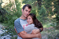
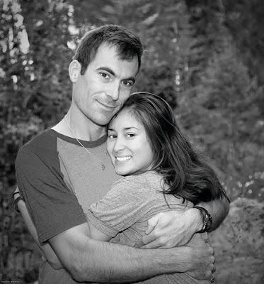
My nephew was getting married and was meeting us for a brief visit with his fianceĆ©. I hadn’t planned to take a portrait of them but thought it would be a nice change to create an engagement photo. They were leaving early in the morning to head back to Los Angeles, so I didn’t have much time to plan the shot—nor did they have time to dress for the session.


LIGHTING AND POSING
I picked an open shade area to avoid any high co
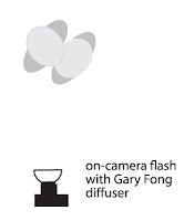
ntrast. There wasn’t much light (f/4 at 1/15 second), so I increased my ISO to 200 to bring it up to 1/30 second at f/4, helping me to avoid motion blur. I set my Canon 530EX flash on the hot shoe, with a Gary Fong diffuser. I then switched my camera to shutter priority (Tv) mode with the camera at 1/30 second.

I had Trevor and Mari turn to each other and asked Trevor to wrap his arms around Mari. I took about three pictures before they had to leave. The rest was a transformation in Photoshop.

POSTPRODUCTION
When I imported the images into Lightroom, thi
s one stood out. I decided to play with it in Photoshop and see if I could dress it up and present it to them as a canvas print.

I exported it to Photoshop and duplicated the background layer. My first step was to crop the image to a square (like the old Hasselblad format), getting rid of the excess background to keep the attention on the couple. Once that was done, I checked the levels and constricted the histogram slightly by sliding the arrows toward the middle.

At this point, I converted the image to black & white using a black & white adjustment layer. Creating this layer brings up a dialog box with color sliders. If you recall the old days of using color filters to alter the black & white tones in your film images, this will look familiar. By sliding the yellows and greens to the left I was able to evenly darken the background to bring out the subjects. Sliding the reds, blues, and magentas to the right lightened their skin tones.

My next task was to lighten their eyes (it was an early-morning shoot, after all!) and brighten their teeth. I used the quick selection tool to select the teeth and eyes on both subjects. I used the refine edges command (Select>Refine Edges) to tweak the selection. Once I was satisfied with it, I used the hue/saturation dialog box to desaturate the tones in their eyes and teeth (–43) and increase the lightness of these areas (+32). You can’t go too far without the change looking artificial.

I then selected the spot healing brush to get rid of a few stray hairs. To remove the dark circles under their eyes, I selected the dodge tool and set it to shadows at 50 percent. I also wanted to soften their faces slightly, which I did using the surface blur filter (radius: 12; threshold: 7).

The last item on my list was removing the Pepsi logo from the t-shirt. I used the polygonal lasso tool to select the Pepsi logo, then eliminated it using the clone stamp tool. It looked good to me, so I flattened the image and sent the file to Canvas on Demand, who shipped the final artwork directly to Trevor and Mari in Los Angeles. (When I visited them, I saw that they did a beautiful job framing the canvas print and hung it in their guest room—a high compliment!)

Editorial note: Please purchase the book to see the full sequence of images and screen shots from this session and postproduction process.